Make your graphic design portfolio stand out with our free guide’s key tips.
入力したメールアドレスが無効です。
ご登録ありがとうございます。
By entering your email, you indicate that you have read and understood our Privacy Policy and agree to receive marketing from Squarespace.
Your graphic design portfolio needs to do more than display your work: It needs to tell a story. Knowing your audience is key to telling an effective story. You know the questions your past clients asked and what their thought process was like. Use this knowledge to inform prospective clients of your skills and experience and build a graphic design portfolio that uniquely expresses your brand and what you offer to your target audience. The following portfolio tips will help you decide how many pieces to feature in your portfolio and why you need a consistent portfolio design even when displaying a variety of work.
Describe the creative process and play to your audience
The landing page of your portfolio website is the most important page, but it can’t be the only one. For each project on your landing page, you need it to link to a new page where you describe the creative process and the role you played in bringing it to life.
Ask yourself these questions as you decide how to tell each project’s story:
Who was the client?
What was the objective of the project?
What role did you play?
Who were your collaborators?
What did your initial sketches look like?
How did you refine your approach to achieve the final result?
What result did it accomplish?
Answer these questions and you’ll tell a story to prospective clients about who you are and how you work. It shows the types of companies you’ve worked with in the past and the roles you’ve played in the design process. It gives direct examples of the results you’ve accomplished, so prospective clients can begin to imagine how you might achieve similar results for them.
Envisioning the types of clients that will see your portfolio can inform which pieces of your past work you include and how you frame each project as a case study. Knowing the language used within a particular industry can help you prove your merits as someone with specific industry experience. Don’t overuse industry jargon, but speaking directly, knowledgeably, and effectively about the industry can go a long way toward proving your qualifications.
How many examples of your work to include
Generally speaking, an effective portfolio should feature four to 10 examples of your work. Fewer than four looks sparse, and you may come across as less experienced or give a prospective client too little information. When you have more than 10 pieces, your portfolio can begin to look cluttered and take the focus off your strongest work.
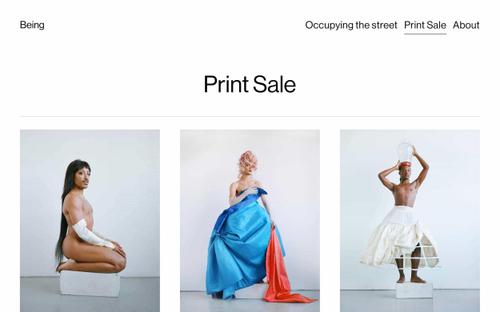
Staying in the range of four to 10 samples allows you to highlight your best work and use large hero images to grab the attention of potential clients. Hero images allow you to fill your landing page with color, shapes, and geometry while allowing site visitors to see small details in your work. Learn how to format images for display on the web or resize them for different platforms, so that they appear as you intend on any size of screen.
If you have more than 10 projects you’d like to include in your portfolio, it’s better to create an Archive page for the rest. Keep your landing page to a maximum of 10 projects that are recent and display the kind of work you want to do, then put the rest on an Archive page. That way, you can make a solid first impression with your landing page, but if someone is really interested in seeing more of your work, they can easily find more examples in your archive.
Use a consistent approach even when showing a variety of work
The order in which you display your work will tell prospective clients the works you think are your best. Lead with what you consider to be your strongest pieces and put them at the top of the page where they will be seen first.
Besides the order in which you arrange your works, you should treat your pieces equally on your landing page. That is, each work on your landing page needs context around it that explains how, why, and for whom it was created.
The landing page should feature large, hero images that show the entirety of each piece. On the supporting page that captions your work and provides context, you can call out and highlight specific details you feel are important.
A consistent design is not only pleasing to the eye; it also makes it easier to navigate your site. With a clear, logical way to move around your portfolio site, visitors will likely stay longer, explore more of your work, and get a better sense of who you are and what you can do. The more a potential client is able to learn about you from your portfolio, the more likely they are to want to interview you and hire you for a job.


