Make your graphic design portfolio stand out with our free guide’s key tips.
入力したメールアドレスが無効です。
ご登録ありがとうございます。
By entering your email, you indicate that you have read and understood our Privacy Policy and agree to receive marketing from Squarespace.
First and foremost, a graphic design portfolio is a way to display your work and talents to prospective employers. The way you choose to design your website and display your work can also communicate a great deal about you and your style. From the page layout and typography to a custom logo and playful interactive elements, you can use the design of your portfolio website to build a brand for yourself.
Defining a brand for your graphic design business
Your online brand ought to reflect your personality, creativity, and design sense. Giving prospective clients a sense of who you are will help them feel more comfortable and confident in hiring you. Especially for longer-term projects, a client will want to know not only that you have the skills and experience to get the job done, but also that you will be someone with whom they’ll enjoy working.
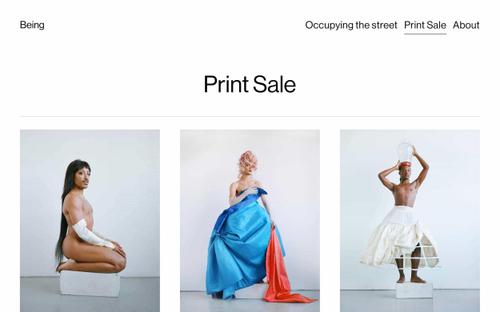
If you lean into your personality and style in designing your portfolio, it will help you stand out in the crowded design industry. Decide on a design approach that fits you and your work and let that inform your choices. Your personality and sense of style are unique, so use that fact to your advantage to create a portfolio that doesn’t look and feel like everyone else’s.
Website design approach: Minimalist or maximalist
One way to grab the attention of visitors to your work portfolio is to employ an abundance of imagery, loud typography, and clever interactive elements that leave very little white space on the page. Such a maximalist style provides ample room for your personality to shine and differentiate you from other designers. However, a maximalist style risks looking overly busy, cluttered, and confusing—so if this is your choice, make sure you can do it effectively.
A safer choice is a minimalist approach, with a clean design and clear message that can be easily navigated. A minimalist design is not without its dangers, the biggest of which is that your portfolio may be seen by clients as overly simple, so be sure to include eye-catching and appealing images.
Your own logo can go a long way toward creating a visual identity for your site and separating you from the pack. Create a custom logo to help build your brand. There’s no better way to show off your logo design skills than creating a strong logo that’s at the center of the design of your portfolio website. Your website should feature your logo at the top of the landing page. Even if a potential client doesn’t remember your name, your logo might stay top of mind.
If you need to resize your logo or other images for social media or other uses, try Squarespace’s free Image Resizer.
Selecting the right color palette also plays an important role in any website’s design. The colors you choose can make your site look and feel different from others and can greatly aid the navigation of your site. It’s doubly important for designers to find a mix of colors that works because it shows you know how to use color effectively to communicate your message. No matter the palette you choose, you should limit the number of colors in your portfolio site’s design to three or four at most to keep the design from looking too busy.
See our top 7 portfolio templates
Don’t overlook typography as a way to express yourself
Typography can have an outsized effect in informing how we feel about a brand. It can frame the brand as modern and casual or timeless and elegant. In choosing a primary typeface or font, you should know that there are two main styles: serif fonts and sans serif fonts. A serif is the decorative, tapered line at the end of a stem of a letter; a well-known example of a serif font is Times New Roman. There are also cursive fonts as well as custom fonts that can be anything you can imagine (e.g., symbols).
A serif font communicates that your brand is sophisticated and timeless but can also make a design seem too buttoned-up or old-timey. A sans serif font is more modern and straightforward and can be more edgy; a well-known example of a sans serif font is Helvetica. Sans serif fonts are popular in digital media because they are easier to read on the screens of various devices that range in size and resolution. Cursive or script fonts can look elegant and can be viewed as both formal and casual, depending on the specific font. Formal script can appear elaborate, like the typeface used in a wedding invitation, while a more casual script can mimic actual handwriting and appear more informal.


