Download a free workbook to help you design your site with confidence.
入力したメールアドレスが無効です。
ご登録ありがとうございます。
By entering your email, you indicate that you have read and understood our Privacy Policy and agree to receive marketing from Squarespace.
When a person navigates to your website, they’ll arrive on a landing page. Depending on where they’re coming from—like a social media post, ad, or search engine results—they might land on your homepage, or another page of your website. No matter the page they’re on, users should be able to easily find your products and services, which all boils down to good website design.
Learn how to design your website landing pages so they maximize user engagement and action.
Identify your objective
A landing page isn’t the same thing as a homepage. Your homepage is the hub of your site, grounding the user and showing them all the different places they can go at a glance. A landing page is much more focused—it’s designed to trigger a specific action, which should always support your business goals.
There are two main types of landing pages:
Lead generation landing pages. A page designed to collect user data so that you can leverage it in sales campaigns is known as a lead generation (“lead gen” for short) or lead capture page. If getting user data is your goal, work out which data you want to capture—name, mailing address, email address, phone number, etc. Also, what are you offering in return? It could be a sign-up to a mailing list or a newsletter, or more immediate, specific information, like a discount code.
Click-through landing pages. A landing page that demands immediate conversion (e.g., buying a product) is known as a click-through landing page. It should feature a call-to-action (CTA) button that drives user interaction. Click-throughs can lead to anything from user review pages to detailed product pages to appointment-scheduling pages to shopping carts. Decide where the click-through will lead by working out how far you intend to propel the customer journey at that step.
Consider your target audience
The primary purpose of a landing page is to let people know that, by taking whatever action you want them to take on your website, they’ll be better off. The more you understand your audience, the more effectively you can address them and encourage them to take your desired action. What are your target audience’s demographics, needs, and pain points? More importantly, how will clicking or filling out details on your landing page help to make their lives better?
Consider having more than one landing page so that you can segment your offer for different audiences—one audience (targeted by one set of ads and social media content) is asked to do one thing, another audience (targeted by different ads and social media content) is asked to do another.
That way, you can A/B test your landing pages to see which performs better, and ultimately improve your understanding of your target audience.
Make your message leap off the page
Great landing pages deliver compelling copywriting that convinces users that they’d be missing out by choosing not to sign up or click through.
A successful click-through headline might ask users a question to arouse their curiosity, e.g., “Want to know the secret to achieving [a specific benefit] and how to get it for yourself?” Whereas a great lead gen headline might focus on the benefit of long-term engagement via sign-up, e.g., “Never miss out on a [name of your brand] limited edition product again.”
Keep copy to a minimum on landing pages. Lengthy text is fine for giving people detailed information. If you want to drive immediate action, though, bullet-point the benefits and give your copy a sense of urgency, e.g., “There’s never been a better time to [carry out this action].”
Finally, make your call to action—the message you add to a button or hyperlinked text on your landing pages—obvious and clear. It should convey, in no more than three words, exactly what you want people to do.
Engage users with graphics, images, and layout
The visual elements of a landing page play a key role in driving conversion and user interaction.
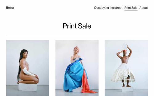
Stunning design, imagery, and typography will influence the user’s decision to take a desired action by raising brand awareness and shaping the way they feel about your business. A simple layout, legible text, and easy-to-understand iconography go a long way in encouraging users to make a purchase, engage with your content, or sign up for your newsletter.
With an effective website builder, you can create beautiful layouts with an appealing color scheme, fonts, and icons. Squarespace’s drag-and-drop grid editor, Fluid Engine, equips you with a web design toolkit that’s intuitive and full of creative possibilities—no code or design expertise required.


