Starting a new project? Download our free workbook to build your brand with confidence.
入力したメールアドレスが無効です。
ご登録ありがとうございます。
By entering your email, you indicate that you have read and understood our Privacy Policy and agree to receive marketing from Squarespace.
Starting a new brand doesn’t have to feel overwhelming. Our Squarespace pros are here to help you understand how to build a brand that feels unique to you and makes you stand out.
Whether it’s choosing your brand name, designing your logo, or establishing your brand voice, watch the video above or read the transcript below for a quick dive into what it means to have an active, engaging, and thriving digital presence.
Transcript
Narrator: The truth is, it's not enough to just exist online. You have to create an identity. Preferably one that is unique, easily identifiable, and ownable to you and your brand. That identity starts with a logo. Like this guy.
Satu Pelkonen: There's typically two different types of logos: wordmarks and symbols. A wordmark is typically a logo where the company name is the focus of the logo. So a good typeface is really important when designing a wordmark. A symbol is a type of logo where a symbol or an icon is the actual thing that represents the brand identity.
Even if I have a good idea of what type of logo I want to create, sketching is actually a good way to kind of test out what kind of ideas work and what doesn't. When you see it on paper, you really get a good idea: “OK, this looks great, this doesn't necessarily.”
Squarespace logo maker is actually a really great tool for someone who doesn't necessarily have the expertise or know-how to use a design software. So it's a quick and easy way for anyone to actually create a logo.
Narrator: Now, let's talk aesthetics and dive into our web design basics. First up: Color theory, and more specifically, color palettes.
Create a color palette and think about how each color will function: Which color will be the background, which for text, and which for buttons or icons. Consider whether each of these colors will make it easier or harder to navigate your site.
Next: fonts. You don't need a different font for every section or title. Pick one font for titles and one for body copy. Then you can play with weight or size to indicate each section's level of importance, making key section titles larger or bolder, and sub-section titles smaller or lighter.
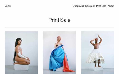
And finally, for aesthetics at least: imagery. No two shops should look the same. So think about how you want to shoot your imagery and what you want that imagery to say about your brand. Do you want to keep all of your imagery super minimal, or do you want to find moments for fun prop design to establish the world you see your brand living in? This is especially important when thinking about how you want to translate your brand on social.
Read our expert guide to web design basics
Puno: So when I first started with the brand, I had a photo that I really liked. I had a font that was a Serif, fun, approachable font. And then I had the name and all three of these things was like the trifecta that made me feel like, “Dang, I got a brand.”
So with your digital brand, it's not just on a website, you're also probably going to be on social. So you want to make sure that you carry your fonts, your colors, your photos, your videos, all of that, and make sure it's consistent with social.
What's great about social, is you can use it as your digital playground or your digital lab and you can just do little mini design experiments on there, even video experiments. And then once you feel good about it, then you can bring that back into the website.
The whole point of this is that you can let your brand evolve, and you can use all these different platforms to just build on each other.
Narrator: Finally, what's an identity without a voice? Establishing a tone of voice for your brand is essential across all platforms. A great way to go about this is to think about your brand as a persona. If your brand were to speak, what would they sound like? What would their cadence be? What vocabulary would they use?
Puno: So when you're thinking about your brand voice, what personality do you want to show? Because for me, I wanted to be a bit more goofy or approachable.
What about you? Do you need to be a bit more vulnerable, so that people understand where you're coming from? Do you need to be a bit more serious? Maybe you need to be a little bit wittier.
It's the tone. It's the vibe. It's the feelings that you want your customers or the people that come across your brand to feel.
Get tips for creating your own brand voice
Narrator: The best brands are active. They are constantly building and expanding upon how they show up in the digital space. So even after you have a clear idea of who you want to be in that space or in your industry, think about how you want to grow as well.
This post was updated on November 10, 2023.


