Download a free workbook to help you design your site with confidence.
入力したメールアドレスが無効です。
ご登録ありがとうございます。
By entering your email, you indicate that you have read and understood our Privacy Policy and agree to receive marketing from Squarespace.
When designing your online student portfolio, there is no one-size-fits-all approach to success. A smart, strategic, and beautiful portfolio can help new graduates land the job and kickstart a career. Recruiters assess many aspects of what you can offer as an artist and creative thinker—not just the work itself. A design portfolio should reflect your best work but also your personal story, including a holistic narrative of who you are as a design student and the skills you’ve picked up throughout your learning process.
Creating a digital portfolio for potential employers in the early stages of your career isn’t as difficult as you might think. Here are five key considerations for creating a stand-out student portfolio website to launch your career.
1. Remember that less is more
Your first instinct may be to squeeze every design and every piece of artwork you've created onto a portfolio site. But in the eyes of a recruiter, less is more and context is key. A smaller set of clearly executed and thoughtfully created work samples can make a bigger impact than a vast collection of projects that may be less polished or less reflective of who you are.
When a recruiter does a portfolio assessment of your work, they want to learn more about you. They want to be able to look at your student work and quickly understand:
What projects are you most passionate about?
What creative and technical skills have you picked up in your academic career?
Including a short summary about yourself and your artistic work in your e-portfolio can help answer these questions.
Recruiters also love to see thoughtful and innovative work for a brand that may be lesser known, rather than less-than-average work for a flashy name. If you don’t have professional experience working at a brand, that’s okay, too. You can start simply by showing how you’d work through test cases or projects for smaller brands.
For example:
What’s a hiccup in a product that can be solved through design, and how would you solve it?
Can you create a campaign or help with brand development for a local small business?
2. Apply design-centered thinking
Use your own portfolio website as a vehicle of artistic expression. A design-centered approach speaks volumes to a recruiter, so think of your portfolio as a piece of art in and of itself.
When it comes to selecting individual projects, showcase the ones you’re most proud of. Each project should tell a narrative that shows off your skillset, professional development, experience, and background. The design of your portfolio and project selection should help the viewer easily see your full artistic capacity and the skills you bring to the table.
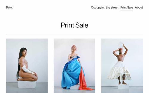
Squarespace offers portfolio templates to help you quickly choose and customize a design that shows your work in its best light. The right portfolio design and portfolio process for you will differ depending on the type of portfolio you’re creating. A graphic design student might choose a gallery grid, for example, whereas a student sharing a lot of animations might choose a design that doesn’t put too much motion on the page at once. Look around at other student portfolio examples to get an idea of how other learners in your discipline are presenting their work.
3. Show your process, especially if it’s messy
Share the obstacles, roadblocks, and mental hurdles that you overcame on a design project you’re showcasing on your site. This helps the hiring employer understand your unique creative process. As a rule of thumb, visitors to your online portfolio should feel like they’re coming along on a journey, rather than stopping and staring at a destination.
Providing context for your designs strengthens the work and allows recruiters to see how your designed concept may be used by real people.
4. Include collaborations
It’s okay to jazz up your portfolio with work that wasn’t a solo project. Collaboration with others shows teamwork and communication, which are important and necessary skills. If you’ve partaken in any internships in your academic career, include those on your site as well. Recruiters want to see the breadth and depth of your work.
In the description of the project, add context that explains your contributions to the collaboration and how you worked with your partner or partners to come to the final result.
5. Share who you are outside of your art
Portfolio websites aren’t just about resumes and showing off your student progress. It’s a plus for recruiters to see students who can offer more than just their honed professional skills. Savvy recruiters want to know who you are outside of your work.
Your online portfolio is the perfect place for you to exhibit your side hustles and let your individuality shine through. Do you weld stained glass in your free time? Do you design podcast covers? All your creative facets are assets, because at the end of the day, recruiters hire the person—not the design skill.
Read more tips on organizing and showcasing your design work online, and get inspired by the changemakers, innovators, and creators of the Class of 2020.
This post was updated on December 19, 2022.


